Quantcast

Jump to content


Photo

Voting - Neocodex Ad Contest

voting ads

  • This topic is locked This topic is locked
34 replies to this topic

Poll: Neocodex Ad Contest (44 member(s) have cast votes)

Which ad would convince you to check us out?

You cannot see the results of the poll until you have voted. Please login and cast your vote to see the results of this poll.
Vote

#1 Emily

Emily
  • Wonder Woman


  • 6508 posts


Users Awards

Posted 26 November 2014 - 09:34 PM

ibg8rJTFKs7tBQ.gif


Voting Ends: 1 December 2014 at midnight


View the original thread with the rules and awards/prizes.


Please do not vote for yourself! 


Now, here are the wonderful entries... 


Entry #1

Spoiler


Entry #2

Spoiler


Entry #3

Spoiler


Entry #4

Spoiler


Entry #5

Spoiler


Entry #6

Spoiler


Entry #7

Spoiler


Entry #8

Spoiler


Entry #9

Spoiler


Entry #10

Spoiler


Entry #11

Spoiler


Entry #12

Spoiler


Entry #13

Spoiler


Good luck!


#2 Prisca

Prisca
  • Clouded Liberty

  • 2494 posts


Users Awards

Posted 26 November 2014 - 09:36 PM

oooh very nice! well done all. :)


#3 KaibaSama

KaibaSama
  • Weeaboo


  • 5640 posts


Users Awards

Posted 26 November 2014 - 09:39 PM

I love #11! The wings and background make it look very pretty, plus I love how what we do slides along the bottom in harmony with the rest of the ad!

#4 Swar

Swar
  • retired cheater

  • 9280 posts


Users Awards

Posted 26 November 2014 - 09:45 PM

#11 is awesome! Gif ads always catch my attention.


#5 Karla

Karla
  • 2478 posts


Users Awards

Posted 26 November 2014 - 09:47 PM

Very nice entries!  #11 i very bright and eye-catching, that's my fav. :D


#6 Grimley

Grimley
  • The greatest trick the Devil ever pulled was convincing the world he didn't exist

  • 3840 posts


Users Awards

Posted 26 November 2014 - 09:59 PM

#11 is prettiest, but #10 got my vote. Neocodex is about so much more than JUST Neopets and Flight Rising...I prefer the more inclusive entries. :D


#7 Trichomes

Trichomes
  • 🐱 💖 🍄

  • 1781 posts


Users Awards

Posted 26 November 2014 - 10:31 PM

I want to vote for #1, but dat typo...


#8 Shane

Shane
  • Sad sack.

  • 1982 posts


Users Awards

Posted 26 November 2014 - 10:32 PM

Hard choice between 13 and 5.


#9 Grimley

Grimley
  • The greatest trick the Devil ever pulled was convincing the world he didn't exist

  • 3840 posts


Users Awards

Posted 26 November 2014 - 10:32 PM

I want to vote for #1, but dat typo...


Yeah actually that's what got to me as well on that one. :p


#10 Shane

Shane
  • Sad sack.

  • 1982 posts


Users Awards

Posted 26 November 2014 - 10:35 PM

13 because it stands out and isn't homogenous with everything else.


#11 Unmata

Unmata
  • 714 posts


Users Awards

Posted 26 November 2014 - 11:21 PM

Great entries everyone! It was hard to decide between 11 & 13. 


#12 Wynd

Wynd
  • 397 posts


Users Awards

Posted 26 November 2014 - 11:34 PM

I voted for #13. I really liked the layout of it. It's pretty.  ;)


#13 Rocket

Rocket

  • 7129 posts


Users Awards

Posted 27 November 2014 - 12:13 AM

Some pretty good entries. I'll have to give myself some time to make a vote 


#14 WeirwoodTreeHugger

WeirwoodTreeHugger
  • 89 posts

Posted 27 November 2014 - 12:50 AM

I REALLY like 11 but idk I always worry about how obvious the site can be. Publicly advertising we have cheating programs and whatnot isn't really a good idea right? I feel like we should be a bit more stealth when it comes to cheating so that's why I picked 13. It's simple, looks suspicious and just isn't out there "WE HAVE AUTOBUYERS LOOK NO FURTHER." type of display.


#15 Vibe

Vibe
  • 469 posts


Users Awards

Posted 27 November 2014 - 02:24 AM

Voted for #9, really loving the flares! It makes it stand out in my opinion ^_^ 
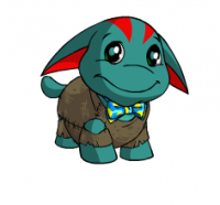
The flares don't feel or look out of placed. :3


#16 Drakonid

Drakonid
  • 804 posts


Users Awards

Posted 27 November 2014 - 02:37 AM

Most of them look like ads from the early 00's


#17 Bones

Bones
  • Bar Ram Ewe

  • 2171 posts


Users Awards

Posted 27 November 2014 - 05:37 AM

Great turnout :D


#2 gmv


#18 Adam

Adam
  • Coffee God


  • 4771 posts


Users Awards

Posted 27 November 2014 - 05:52 AM

I REALLY like 11 but idk I always worry about how obvious the site can be. Publicly advertising we have cheating programs and whatnot isn't really a good idea right? I feel like we should be a bit more stealth when it comes to cheating so that's why I picked 13. It's simple, looks suspicious and just isn't out there "WE HAVE AUTOBUYERS LOOK NO FURTHER." type of display.

Why should we be more stealth about cheating? Codex has been around for 10+ year's, and everything has been fine. Not to mention that there have been countless other cheating sites that have come and gone. The only time you have to worry about being at risk is if you're careless and put out information that could get you frozen.

Oh and #11 got my vote; most of the others look like cheap advertisements from year's ago that I'd get rid of with adBlock.

#19 Dazz

Dazz
  • Musicyclopedia

  • 3242 posts


Users Awards

Posted 27 November 2014 - 06:08 AM

Oh and #11 got my vote; most of the others look like cheap advertisements from year's ago that I'd get rid of with adBlock.


Shots fired. I picked #5 cause it's simple, easy on the eyes, straight to the point and in Codex's same style. #11 is cool but it takes 10 seconds before the ad is full circle, if i'm scrolling past i'm only gonna see one line of information before i'm past it.


But if #5 was changed to a more brighter text like white that would make it perfect imo


#20 Jake1

Jake1
  • 39 posts

Posted 27 November 2014 - 09:01 AM

i like #11 because it looks so cool!


#21 blue

blue
  • doge

  • 2048 posts


Users Awards

Posted 27 November 2014 - 09:34 AM

I wish there would've been a competition to update Codex's logo first...


With that in mind I voted for #11 since they kinda modernized the logo graphically and it looks the best IMO.


#22 Swar

Swar
  • retired cheater

  • 9280 posts


Users Awards

Posted 27 November 2014 - 09:40 AM

I wish there would've been a competition to update Codex's logo first...


I had the same thought when I was doing my banner.

#23 Grimley

Grimley
  • The greatest trick the Devil ever pulled was convincing the world he didn't exist

  • 3840 posts


Users Awards

Posted 27 November 2014 - 11:15 AM

I wish there would've been a competition to update Codex's logo first...


With that in mind I voted for #11 since they kinda modernized the logo graphically and it looks the best IMO.


I don't know, I rather like the old-school logo, especially since Neocodex has been around more than a decade...though I way like how #11 utilized it. :D


#24 Emily

Emily
  • Wonder Woman


  • 6508 posts


Users Awards

Posted 27 November 2014 - 11:59 AM

I wish there would've been a competition to update Codex's logo first...
 
With that in mind I voted for #11 since they kinda modernized the logo graphically and it looks the best IMO.


Maybe there will be one :p

#25 Guest_Kate_*

Guest_Kate_*

Posted 27 November 2014 - 12:35 PM

I want to vote for #1, but dat typo...

Dammit, didn't notice, can't unsee, gotta change my vote. 

Sorry #1


Also tagged with one or more of these keywords: voting, ads

0 user(s) are reading this topic

0 members, 0 guests, 0 anonymous users