Quantcast

Jump to content


Photo

Website Layout Help


  • Please log in to reply
7 replies to this topic

#1 milkman

milkman
  • 64 posts

Posted 10 December 2006 - 07:48 PM

Since bluehost is down, I can't show you what it currently looks like, but I added a gradient to the bg, and I like it much better. Current Look:


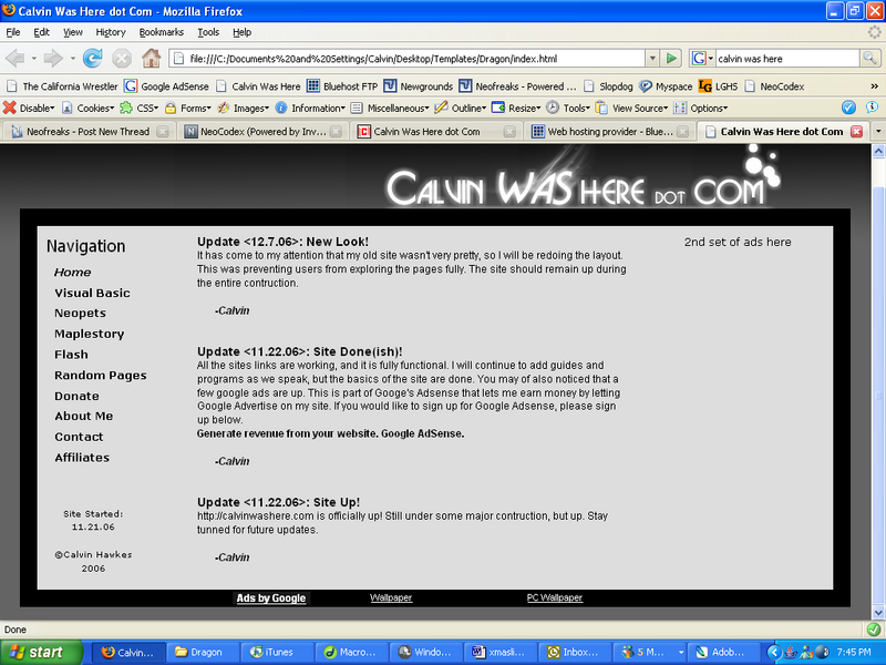
My question is, what should I do with the main part, the container? Its the part that is currently gray. Should I add some color? Back away from the black-white-gray theme? Add a bg image just for the sidebar? Give me some ideas! I'm not artistic/creative at all.


#2 Sean

Sean
  • 6188 posts


Users Awards

Posted 10 December 2006 - 08:58 PM

*Offtopic*
By any chance do you play Warcraft 3 by the name of Milk-Man?

#3 milkman

milkman
  • 64 posts

Posted 10 December 2006 - 09:02 PM

Nope, that's not me.

#4 j0k3r210

j0k3r210
  • 1508 posts

Posted 10 December 2006 - 09:21 PM


QUOTE(Sean @ Dec 10 2006, 08:58 PM) View Post
*Offtopic*
By any chance do you play Warcraft 3 by the name of Milk-Man?


*offtopic* dont sweat it! i thought i say Balmug on gunz:North America version

#5 milkman

milkman
  • 64 posts

Posted 10 December 2006 - 10:01 PM

So its okay to post off-topic posts if you warn people first???

#6 hoju

hoju
  • 1831 posts

Posted 11 December 2006 - 09:47 AM

It's generally okay to be off topic here tongue.gif

#7 Tim

Tim
  • 2795 posts

Posted 11 December 2006 - 02:06 PM

Make a collage of all the things your site will be about and put it in the background of the text. smile.gif

#8 Justin

Justin
  • <img src ='http://i32.tinypic.com/302oyrp.jpg'>

  • 3595 posts

Posted 11 December 2006 - 02:11 PM

IMO the gradient you added is too sudden. Try using a lighter black color for the top color. Maybe just leave the container alone?


0 user(s) are reading this topic

0 members, 0 guests, 0 anonymous users