Quantcast

Jump to content


Pawn

Member Since 06 Apr 2011
Offline Apr 26 2013 01:36 PM

Posts I've Made

In Topic: The Small Islands ARE Krawk Island

22 July 2011 - 09:25 PM

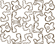
This is the pic of the pieces of the island scattered about:
Posted Image

I've seen a screenshot of what it looks like when you find krawk island but I don't remember where the screenshot is..

In Topic: What Ps3 Should i buy :)?

20 July 2011 - 02:44 PM

I'm guessing you are just interested in buying a PS3 from a nearby store. I'd say just buy the 120GB.

I had an 80GB one for 2.5 years and never filled it up. It was backwards compatible and I never played PS2 games so I sold it for more than I paid for it and bought the 160GB model in January and will probably never fill this one up. Besides, for the price you'd pay for the next model up it would be cheaper just to replace the hard drive which is piss easy.

You could get a 160gb ps3 for $299 or I think a 250gb PS3 for $399. That`s $100 for 90gb. Why do that when you could pay $93 for THIS. 1000 more GB for less than the cost of the upgrade. Or even THIS one... it`s way cheaper just to replace the hard drive in the cheapest model you can get. and like I said earlier, it`s really easy to just switch the hard drive. Open a door, take out a screw, pull out the hard drive, put the new one in, put the screw back in, shut the door... done.

In Topic: The Last Harry Potter Movie!!!111

16 July 2011 - 07:07 PM

I shed a few tears at the end of the epilogue scene when the Hogwarts Express pulled away. It's almost symbolic... symbolizing the end.

In Topic: Sotw #10 - THE RESULTS!!

09 July 2011 - 04:45 PM

I voted for 9. I also feel a need to comment on every sig. I'm not going to cover my opinions with sugar and chocolate so if you don't like what I have to say about your sig, suck it up.


1. Took me a bit to actually figure out how this relates to harry potter. looks hand drawn, and if it is kudos to you but it would probably work better as fanart.

2. It reminds me of a slide projector or an old movie. It caught my eye at first but it's really not much... throw on a sepia tone on some images and animate it and your done... I can see this one winning though since people will be bedazzled by the animation and ignore the lack of actually artistic skill required to make something like this.

3. The drawing of Hermoine is very cute, though there are things that stand out that make me believe after the drawing, the rest was thrown together in paint. it''s also very blank behind the text, could have done something there.

4. Not much to say about this one. There's the pic, then some text slapped on top. Could throw that together in 2 minutes once I found the image and font.

5. I'm not sure what about this one makes me dislike it... Snape's head being half cut offis one thing... it's like the text is the main focus of the sig rather than Snape himself.

6. Same comment as number 4, except they threw a squared design overtop. Nothing special here.

7. I don't really know what to say about this one. it's nice, but could be better. Use of the Harry Potter font is cool, I'm surprised more people didn't use it. Snape is a dark character so a dark sig suits him but it almost feels boring to look at.

8. Too contrasted.

9. This one gets my vote. The text looks good and suits the sig (text is something I'm terrible at in sigs.) the light source at the end of the want and the surrounding design fits in nicely, gives it a touch of magic. I'm not really sure whats going on in the background though. usually backgrounds have some sort of flow to them but I can't find any, overall though very nice.

10. I have absolutely nothing to say about this...

In Topic: Anti-Jokes

09 July 2011 - 04:17 PM

How many blonds does it take to change a lightbulb?
One, and maybe a stepladder depending on the height of the blond.

Why can't Hellen Keller drive?
Because she's a blind deaf mute.