
Quantcast

What works and what is paused · Email is limited to account activation and password resets.

Jump to content


Photo

Aleu returns with some siggies


  • Please log in to reply
11 replies to this topic

#1 Aleu

Aleu
  • 14 posts

Posted 28 April 2006 - 06:28 PM

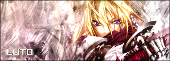
Some of my favorites that I've made :

Posted Image

Posted Image

Posted Image

Posted Image

Posted Image

Edited by Aleu, 28 April 2006 - 07:07 PM.


Advertisement

    #2 Bora

    Bora
    • 955 posts

    Posted 28 April 2006 - 08:35 PM

    I like your first one the best :)

    #3 Fox

    Fox
    • <img src ='http://i25.tinypic.com/4jw8jl.png'>

    • 3247 posts

    Posted 29 April 2006 - 12:42 AM

    Yeah, I agree, the first is great. :D The text is a little too subtle in the first but it's still very nice.

    I also really like the green one, that's pretty unique, especially the text. :) Great work!

    #4 Gargar

    Gargar
    • 4901 posts

    Posted 29 April 2006 - 12:53 AM

    The thrid one looks the best to me. :D But they all look great. :D

    #5 supatyson

    supatyson
    • 1959 posts

    Posted 29 April 2006 - 03:14 AM

    Damn they are good. I love the green one. Great return!

    #6 Guest_Xth Cannon_*

    Guest_Xth Cannon_*

    Posted 29 April 2006 - 04:26 AM

    Those signatures are truly amazing :o The second one is my personal favourite :)

    #7 Ilya

    Ilya
    • 2419 posts

    Posted 29 April 2006 - 04:43 AM

    Wow your sigs are mad good its like perfect combimation with the bg perfect blending... :o

    Appply for the gfx team :D

    #8 Rush

    Rush
    • 1812 posts

    Posted 29 April 2006 - 05:01 AM

    wow..I really like the first one you made ^_^

    #9 Freddy

    Freddy
    • 5500 posts


    Users Awards

    Posted 29 April 2006 - 08:50 AM

    All of those are very awesome. The background, the renders, etc. The only problem with your work is the text. I find it terrible and ugly. Just look at some tutorials and learn how to do some good text, then you will be all set. :) nice work!

    #10 SupermanFTM

    SupermanFTM
    • 5817 posts


    Users Awards

    Posted 29 April 2006 - 09:09 AM

    The second and last are my favorites. Your sigs all seem to have a blank space which is kind of...annoying ;)

    #11 Aleu

    Aleu
    • 14 posts

    Posted 29 April 2006 - 02:59 PM

    Text has always been my weak point in gfx, I find they usually look pretty good if I take it out xD

    Blank space? Care to explain a bit? o.o

    #12 Tetiel

    Tetiel
    • 11533 posts


    Users Awards

    Posted 29 April 2006 - 08:23 PM

    Some of your sigs are so cute! And by blank space he means negative space. Typically it looks good to have the image fill up the sig like you did on your first one ^_^


    1 user(s) are reading this topic

    0 members, 1 guests, 0 anonymous users


