Quantcast

What works and what is paused · Email is limited to account activation and password resets.

Jump to content


Photo

I'Z


  • Please log in to reply
12 replies to this topic

#1 Vuldrance

Vuldrance
  • 548 posts

Posted 27 March 2007 - 05:24 PM


Advertisement

    #2 padora

    padora
    • 991 posts

    Posted 27 March 2007 - 05:29 PM

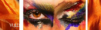
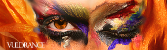
    Second one is better. In the first one the white lines don't really look right tongue.gif Only problem with the second one is that the last letter in your name is barely visible.

    #3 Nick

    Nick
    • <img src="http://i29.tinypic.com/9iwl5w.jpg">

    • 6051 posts


    Users Awards

    Posted 27 March 2007 - 05:42 PM

    Oh my god, did you do the eye make-up? That's, wow.

    #4 kuwaz

    kuwaz
    • 1181 posts

    Posted 27 March 2007 - 05:52 PM

    Funky, hella funky.

    #5 SupermanFTM

    SupermanFTM
    • 5817 posts


    Users Awards

    Posted 27 March 2007 - 07:49 PM

    Mhmm, it really is! Very nice vuldrance, that's a beautiful piece tongue.gif And I agree, the white just makes the sig look choppy, V2 is better IMO smile.gif

    #6 Bilal

    Bilal
    • 1087 posts

    Posted 28 March 2007 - 12:51 PM

    nice siggy mate...that makeup is wierd...lol...and yeah as other people said that white lines don't really fit in with the rest of the sig in the first one...second ones better but the text still needs work...

    #7 Wicked

    Wicked
    • 2057 posts

    Posted 28 March 2007 - 01:05 PM

    I like the second one better. Good job!

    #8 Jeff

    Jeff
    • 2342 posts

    Posted 28 March 2007 - 02:19 PM

    Actually, I might be wrong, but I believe the eyes and all is a stock. Nice job, though.

    #9 Vuldrance

    Vuldrance
    • 548 posts

    Posted 28 March 2007 - 06:22 PM

    Of course the eyes/face is a stock! tongue.gif It's still the outcome that counts though, and thanks.

    http://i28.photobuck...it/EyesOrig.png

    #10 cokiwah

    cokiwah
    • 1655 posts

    Posted 28 March 2007 - 08:30 PM

    gl on sotw ^^ lots of colors in this oneee.

    #11 Sweeney

    Sweeney
    • 1230 posts


    Users Awards

    Posted 30 March 2007 - 06:04 AM

    ... He/She/It has no nose 1we8.gif

    #12 Jewbert

    Jewbert
    • 3387 posts

    Posted 30 March 2007 - 06:42 AM

    I like the second one as well. The big white lines just don't look right to me. But great job!

    #13 shinkai_gms

    shinkai_gms
    • 42 posts

    Posted 30 March 2007 - 12:48 PM

    very nice work...

    but...
    what is this?o.O

    Edited by shinkai_gms, 30 March 2007 - 12:50 PM.


    1 user(s) are reading this topic

    0 members, 1 guests, 0 anonymous users


