

Edited by channel_49, 15 July 2009 - 11:38 PM.

Slant Grid Systems
Started by kuwaz, Feb 28 2009 09:20 PM
8 replies to this topic
#2
Vitalis
-

-

- 252 posts
Posted 28 February 2009 - 09:46 PM
When it's more than a couple of lines of text, I agree. But when it's just there to be aesthetically pleasing and not so much to be read, I don't think it's really that big of a problem.
It's all personal preference in the end anyway, I think.
It's all personal preference in the end anyway, I think.
#3
kuwaz
-

-

- 1181 posts
Posted 28 February 2009 - 10:01 PM
It's perfectly fine in what you were doing. But some people set a
lot of type in this kind of grid, which seriously kills my neck and it's
really not that appealing or readable.
lot of type in this kind of grid, which seriously kills my neck and it's
really not that appealing or readable.
Edited by channel_49, 28 February 2009 - 10:13 PM.

#5
kuwaz
-
-
- 1181 posts
Posted 01 March 2009 - 11:33 AM
TYPEFACES:
Rockwell, Roman.
Optima, Roman, Small caps.
Forgot the leading, I didn't save.
Both Opentype, and I believe the foundry is LT for Optima,
not too sure about the rockwell, perhaps ITC?
Rockwell, Roman.
Optima, Roman, Small caps.
Forgot the leading, I didn't save.
Both Opentype, and I believe the foundry is LT for Optima,
not too sure about the rockwell, perhaps ITC?
Edited by channel_49, 01 March 2009 - 11:33 AM.
#6
Nick
-

-

- 6051 posts
<img src="http://i29.tinypic.com/9iwl5w.jpg">
Posted 18 March 2009 - 10:58 PM
Neville Brody:


Wim Crouwel

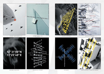
Paula Scher:


But I guess they're probably doing it wrong, hm?
#7
Cory
-

-
- 7487 posts
Dinnerbone'd
Posted 19 March 2009 - 08:01 AM
I'm assuming those are supposed to be important? In my opinion, the ignorant spectator, they all look horrible and hard to understand with the exception of the first one by Paula Scher.
#8
kuwaz
-
-
- 1181 posts
Posted 19 March 2009 - 05:32 PM
QUOTE (Cory @ Mar 19 2009, 12:01 PM) <{POST_SNAPBACK}>
I'm assuming those are supposed to be important? In my opinion, the ignorant spectator, they all look horrible and hard to understand with the exception of the first one by Paula Scher.
How right you are.
On a side note... look at how much copy they're setting, and you'll see why it actually works for those pieces.
Edited by channel_49, 19 March 2009 - 05:38 PM.
#9
Tyler.
-

-

- 2373 posts
<img src='http://i29.tinypic.com/9bevfc.jpg'>
Posted 24 March 2009 - 07:39 PM
I think that if you must turn your neck to read that, especially to the degree that it hurts, you're doing something wrong. And word design isn't your only problem.
My graphics thing for the year.
My graphics thing for the year.
1 user(s) are reading this topic
0 members, 1 guests, 0 anonymous users

