

Leo's Content
There have been 198 items by Leo (Search limited from 17-June 23)
By content type
See this member's
#623791 Planet o_o and stars
 Posted by
on 27 April 2006 - 08:27 AM
in
Arts & Graphics General
Posted by
on 27 April 2006 - 08:27 AM
in
Arts & Graphics General
Ye looks good, though looks like the right part of the planet is just copy pasted and flipped as the land doesnt fit together
#623789 Siglet
Posted by
on 27 April 2006 - 08:25 AM
in
Arts & Graphics General
Fair enough, kept text simple as not to overpower the render.
Though I'm starting to blame monitors for the show of colour, it seems to show better on some than others. Something I must consider for future projects.
Ty for all comments, and glad you liked the tutorial
Though I'm starting to blame monitors for the show of colour, it seems to show better on some than others. Something I must consider for future projects.
Ty for all comments, and glad you liked the tutorial
#623342 Siglet
Posted by
on 26 April 2006 - 12:52 PM
in
Arts & Graphics General
*points to sig*
Made a tutorial to go with as well, check the tut section.
comments/critz welcome.
Made a tutorial to go with as well, check the tut section.
comments/critz welcome.
#584715 my latest work
Posted by
on 15 March 2006 - 02:15 PM
in
Arts & Graphics General
Hmm they all have some very nice backgrounds, although sometimes the render doesnt blend in too nicely like in 2 and 3. Some of your text are arranged right towards the edge, especially in sig 3.
Netherless, some nice work
Netherless, some nice work
#584713 Siggy FFAC
Posted by
on 15 March 2006 - 02:12 PM
in
Arts & Graphics General
Dull? Hmm ok, I didnt put too much multicolour in here. A sharpen will probs help too. thanks for comments
#584707 Calm Beginnings #1 - Revised!
Posted by
on 15 March 2006 - 02:10 PM
in
Arts & Graphics General
oo nice feel to the sig, luffy colours. Text bit small though, and cant see a stroke

#584599 Siggy FFAC
Posted by
on 15 March 2006 - 12:06 PM
in
Arts & Graphics General
Havent made a sig in a long time, so make a quicky
Umm c/c i suppose must learn from everything
Umm c/c i suppose
must learn from everything
#584580 Text Suggestions?
Posted by
on 15 March 2006 - 11:53 AM
in
Arts & Graphics General
www.dafont.com
Try dirtyheadline.. usually blends in well
Try dirtyheadline.. usually blends in well
#584577 Jade Empire
Posted by
on 15 March 2006 - 11:52 AM
in
Arts & Graphics General
Its cool, shame about the render. Might as well and just expand the canvas to see more of render, be flexible xiphos
#546774 Masking
Posted by
on 24 January 2006 - 09:53 AM
in
Arts & Graphics General
Erm, open image with transparent background, erase white bits. Can use magic wand to select all the white parts then just hit delete. Think thats what you mean :blink:
#546773 Wagner :)
Posted by
on 24 January 2006 - 09:50 AM
in
Arts & Graphics General
Interesting.. in fact I think tis pretty good Luffy blue
Luffy blue
#546772 Guardian Angel
Posted by
on 24 January 2006 - 09:48 AM
in
Arts & Graphics General
Lovely pic, Casilla is very lucky
Nothing needs to be changed.. so I guess that means its perfect! xD
Nothing needs to be changed.. so I guess that means its perfect! xD
#546770 A Sig
Posted by
on 24 January 2006 - 09:46 AM
in
Arts & Graphics General
Hmm not a big fan of pop up sigs, anyways, what you have produced seems neat nonetheless. Except on the edge of the render where it blurrs, is a straight blurred line where it stops. You need to patch that bit up.
Text could do with some work, try some colour and perhaps diff font
Text could do with some work, try some colour and perhaps diff font
#539844 My Resi Sig
Posted by
on 16 January 2006 - 09:55 AM
in
Arts & Graphics General
Oh yeah 
I blame my headache...
I blame my headache...
#539786 Rate My New Signature
Posted by
on 16 January 2006 - 09:28 AM
in
Arts & Graphics General
Lower opacity on the white glossy bit.. and keep text not to multicoloured.. and it look a lot better
#539777 My Resi Sig
Posted by
on 16 January 2006 - 09:26 AM
in
Arts & Graphics General
Great work, luving the rather wacky sig shapes Drop shadow on the sig creates nice effect also
Think one with text is best, as text always can make the sig look 'complete'
Drop shadow on the sig creates nice effect also Think one with text is best, as text always can make the sig look 'complete'
#536068 Simple-ish.
Posted by
on 12 January 2006 - 08:45 AM
in
Arts & Graphics General
The stroke on text seems too dark making it look rather unsmooth.. maybe lower the opacity of text stroke and add a outer glow. Love outer glows, they can make text look that much better 
Wub background, very appealing
Wub background, very appealing
#536067 Mr.bumblebee
Posted by
on 12 January 2006 - 08:42 AM
in
Arts & Graphics General
Uhh Mr.bee is actually flying away from the flower... not to it..Add to the other comments and it looks like the bee is flying backwards. O.o don't know though, just kinda looks like it, the broader stripe on them is on their butt, not their head, so it looks funny.
It's beautiful work! 8/10 Only cause the bee bothers me so much. O.O
With this much positive feedback I will defiantly be producing more in the future, if I can rack my brain that is and find the time
#535488 I Was Killed By...
Posted by
on 11 January 2006 - 02:24 PM
in
Jokes and Fun Stuff
"After killing his family in an insane rage, Herakles (also known as Hercules) received orders from the oracle at Delphi to perform 12 labors to purge his sin. These were assigned by Eurystheus, king of Mycenae.
The first involved killing the monstrous, man-eating lion of Nemaea (Leo, the Lion). He tried to kill it with his special arrows and his club, but both weapons broke into pieces as if they were made of clay. After using the weapons in vain, he strangled the lion with his bare hands, succeeding his first task."
I was killed by Hercules
#535471 Text Help...
Posted by
on 11 January 2006 - 02:16 PM
in
Arts & Graphics General
Sig looks pretty good, as for text I'd say all it needs maybe is a 1 px black stroke or dark colour, with the opacity lowered to finish it off. The text actually suits the theme of the sig, in my eye anyway.
#535464 Mr.bumblebee
Posted by
on 11 January 2006 - 02:13 PM
in
Arts & Graphics General
Haha yeah kinda pointless to just say nice job and leave no advise..Thanks, recently I have been trying to post comments which will actually help people improve their signatured rather then just say 'Nice job' and bugger off >.<
But the compliments are nice nonetheless

#535456 New Siggy
Posted by
on 11 January 2006 - 02:10 PM
in
Arts & Graphics General
Interesting shape, quite like it, except I find top left corners bit sharp. Less of the corners and I think it look great.
#535444 Mr.bumblebee
Posted by
on 11 January 2006 - 02:06 PM
in
Arts & Graphics General
Ah good point, I may have to fix that later if it bugs me enough.
Oh and you have a sharp eye
Oh and you have a sharp eye
#535410 Mr.bumblebee
Posted by
on 11 January 2006 - 01:51 PM
in
Arts & Graphics General
Ty for your wubly comments, and the sig is acutally another art work which I post at a later date.
#535388 Mr.bumblebee
Posted by
on 11 January 2006 - 01:40 PM
in
Arts & Graphics General
Bit of vector work, and what I been up to while inactive. The flower pot is actually a pic I took then went over in Illustrator.. the flower is a lot more complicated so I left a few bits out :E
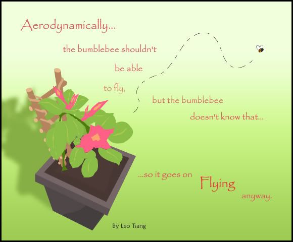
What you think?
What you think?

