Quantcast

Jump to content


Photo

Voting for Boggart's Siggy Competition :)


  • Please log in to reply
47 replies to this topic

#26 Boggart

Boggart
  • Professional Napper

  • 7981 posts


Users Awards

Posted 29 March 2011 - 11:13 AM

Some of these are fucking terrible.

It's going to come down to 2.. *maybe* 3 of them.


But isn't that how it always is? :p

Not that they're terrible, that usually 2-3 are always in the lead

#27 Tarabyte

Tarabyte
  • 230 posts

Posted 29 March 2011 - 11:17 AM

I was pretty happy with mine this time. Even the text. But who can compete against trannies & asian fathers?

#28 nubcke

nubcke
  • 15 posts

Posted 29 March 2011 - 11:24 AM

I honestly don't know how seven is getting so many vote. O_o

The technical aspect of it isn't much...

#29 jaredennisclark

jaredennisclark
  • 838 posts

Posted 29 March 2011 - 11:38 AM

I honestly don't know how seven is getting so many vote. O_o

The technical aspect of it isn't much...


Well then kudos to them then. They've created an eye-pleasing signature with minimal time, skill, and effort. Blows most of the others out of the water in my opinion.

The voting results really should be kept private until after they have been tallied though.

#30 nubcke

nubcke
  • 15 posts

Posted 29 March 2011 - 11:43 AM

Granted that it blows many others out of the water, when you look at a competition such as this there should be some skill demonstrated in the winning signature. While aesthetics surely are the main factor in regards to voting, I don't think it should be everything.

#31 jaredennisclark

jaredennisclark
  • 838 posts

Posted 29 March 2011 - 11:53 AM

I agree. When it comes to my vote, I go for what catches my eye simply because I know next to nothing about digital art.

It's a little like curling. To the untrained eye it's two people sweeping the ice and pushing a weight. To someone with some knowledge of it however, there is strategy involved in every movement.

Edited by jaredennisclark, 29 March 2011 - 11:56 AM.


#32 Boggart

Boggart
  • Professional Napper

  • 7981 posts


Users Awards

Posted 29 March 2011 - 12:11 PM

I agree. When it comes to my vote, I go for what catches my eye simply because I know next to nothing about digital art.

It's a little like curling. To the untrained eye it's two people sweeping the ice and pushing a weight. To someone with some knowledge of it however, there is strategy involved in every movement.


Well I never said to vote for the one that took the most skill, it's just whichever you liked the most :p

People should realize that we're simpletons and generally like pretty things instead of depth and layers or whatnot

#33 Fresca

Fresca
  • 514 posts

Posted 29 March 2011 - 12:32 PM

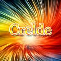
I don't have anything other than basic fonts, so my font ended up boring. :/


http://www.dafont.com/ bro. Also, you can make even "basic fonts" look good depending on the styling. Designers regularly use fonts like Arial. I'm not saying they always come out great, just that it's possible.

#34 Mahas

Mahas

  • 503 posts

Posted 29 March 2011 - 12:51 PM

Yeah i admit i had trouble with the text on mine..... (never good with text)

Hoping i can grab some nice fonts for mahself soon xD and im not spamming cus everything i say is all to do with this whole thread, and i am sorry that for a few hours there werent many people actually online and participating in this thread....Posted Image

#35 Code

Code
  • Patron of Absorbia

  • 435 posts

Posted 29 March 2011 - 12:53 PM

Some interesting entries you got there :p

Voted for the one I like the most xD May the best siggy win~

#36 Boggart

Boggart
  • Professional Napper

  • 7981 posts


Users Awards

Posted 29 March 2011 - 01:03 PM

Some interesting entries you got there :p

Voted for the one I like the most xD May the best siggy win~


I was actually hoping you'd enter in this contest Code, since you made my original signature and al ^_^

#37 Kido

Kido
  • 1046 posts

Posted 29 March 2011 - 01:23 PM

ehhh? I thought we weren't voting on the text ones. I always said it looked bad with text :p

#38 Guest_Serperior_*

Guest_Serperior_*

Posted 29 March 2011 - 01:24 PM

http://www.dafont.com/ bro. Also, you can make even "basic fonts" look good depending on the styling. Designers regularly use fonts like Arial. I'm not saying they always come out great, just that it's possible.


Thank you Fresca, but I usually add text online since I only have MS Paint and have minimal things to do. So I can't download fonts for the online things, to my knowledge. +repped though, cause I can get some more fonts for MS Paint. ^_^

Edited by Serperior, 29 March 2011 - 01:24 PM.


#39 Boggart

Boggart
  • Professional Napper

  • 7981 posts


Users Awards

Posted 29 March 2011 - 01:43 PM

ehhh? I thought we weren't voting on the text ones. I always said it looked bad with text :p


I don't know what you're talking about *cough*

(my bad)

#40 Kido

Kido
  • 1046 posts

Posted 29 March 2011 - 02:03 PM

wow. I just realized how..."canadian" my post sounded. And it's fine Boggart . Just wanted to point it out and all

#41 Persuasion

Persuasion
  • 551 posts

Posted 29 March 2011 - 03:58 PM

Lol some of these are really funny =P

The signitures varied in theme so much I wasn't really sure how to choose, though I chose the one most appealing austetically :) Goodluck to everyone who entered :)

#42 Code

Code
  • Patron of Absorbia

  • 435 posts

Posted 29 March 2011 - 05:21 PM

I was actually hoping you'd enter in this contest Code, since you made my original signature and al ^_^


Sorry about that D:

I didn't really have time to make one, and I felt like someone else should make you one this time x)

#43 Mahas

Mahas

  • 503 posts

Posted 30 March 2011 - 02:43 AM

All i have to say at the moment is this: One of these signatures is just totally this -----> Posted Image

#44 Boggart

Boggart
  • Professional Napper

  • 7981 posts


Users Awards

Posted 30 March 2011 - 06:25 AM

But it's a race for second! xD Two tied for second and another with only 1 vote less :o

#45 Mahas

Mahas

  • 503 posts

Posted 31 March 2011 - 03:14 AM

Oh wow, it really is a race... I like them all so much though Posted Image

#46 crelde

crelde
  • 160 posts

Posted 02 June 2011 - 03:49 AM

awesome siggs :) gj!

#47 luvsmyncis

luvsmyncis
  • I have no friends.

  • 6724 posts


Users Awards

Posted 02 June 2011 - 05:55 AM

awesome siggs :) gj!


You're stupid. No offense.

#48 Strategist

Strategist
  • Sadmin

  • 10012 posts


Users Awards

Posted 02 June 2011 - 09:23 PM

You're stupid. No offense.


We all know your 'no offence' means 'offence intended' :p haha


0 user(s) are reading this topic

0 members, 0 guests, 0 anonymous users