Quantcast

What works and what is paused · Email is limited to account activation and password resets.

Jump to content


Photo

SOTW #31 Voting


  • This topic is locked This topic is locked
27 replies to this topic

Poll: SOTW #31 Voting (42 member(s) have cast votes)

Vote for your favorite!

You cannot see the results of the poll until you have voted. Please login and cast your vote to see the results of this poll.
Vote

#1 Pamplemousse

Pamplemousse
  • 51 posts

Posted 16 March 2012 - 03:27 AM

Before voting, please be sure that you have read the rules regarding the voting process found HERE


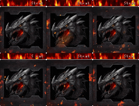
1. Posted Image
2. Posted Image
3. Posted Image
4. Posted Image
5. Posted Image
6. Posted Image
7. DISQUALIFIED FOR VOTING ON THEIR OWN SIGNATURE. READ THE RULES LIKE I TOLD YOU
8. Posted Image

Voting Closes: When...tie-breaker happens. xD Vote guys!


Edited by Pamplemousse, 18 March 2012 - 05:55 AM.
Disqualified signature #7


Advertisement

    #2 onlyme

    onlyme
    • I hate everyone.

    • 4319 posts


    Users Awards

    Posted 16 March 2012 - 04:31 AM

    oh i like number one : D

    and nr eight...
    Posted Image


    #3 Blissey

    Blissey
    • 581 posts

    Posted 16 March 2012 - 06:05 AM

    Had to give it to #3.
    I laughed.
    Probably more than I should've.
    Then laughed again at #8.
    Damn.

    #4 Nymh

    Nymh
    • Keeper of Secrets

    • 4626 posts


    Users Awards

    Posted 16 March 2012 - 06:17 AM

    Haha I actually LOL'ed at #8 - congrats to whoever that is, that's probably only the second time I have LOL'ed at a picture in my life

    I love #1, 3 and 4 ... such a tough choice this week! I think I am gonna go with #1 since it is the best done out of my 3 favorites IMO

    Ok here is my feedback on all of them:
    #1 if it was a little dirtier and grainier I think I would like it better, and if the animation was longer
    #2 WTF srsly?
    #3 I wish it was formatted better. I really love the idea though and I think it has potential to be a better sig
    #4 This would be so awesome if the cropping was better and the lettering that was added was just a touch higher quality
    #5 Is it a gelert? It is pretty but I am having a hard time relating it to Neo/Codex
    #6 Heh, it's cute
    #7 Unless the Angelpuss is sad because the program manager is broken I can't really see how this relates. It's pretty though
    #8 again, haha

    #5 Boggart

    Boggart
    • Professional Napper

    • 7981 posts


    Users Awards

    Posted 16 March 2012 - 06:49 AM

    I don't need to explain why I voted for what I did 'cause I'm elitist.

    #6 zryii

    zryii
    • 26 posts

    Posted 16 March 2012 - 07:44 AM

    I thought #2 was pretty hilarious, but #1 is an easy winner

    #7 Icey Defeat

    Icey Defeat
    • 8298 posts


    Users Awards

    Posted 16 March 2012 - 10:09 AM

    Why is #8 so funny?

    #8 Galadriel

    Galadriel
    • Creature of the Night

    • 924 posts


    Users Awards

    Posted 16 March 2012 - 10:17 AM

    I thought #2 was pretty hilarious


    I must be missing something.
    (I see the neocodex link)

    I voted for #1 because it is awesome. Nice job, mystery maker.

    #9 Strategist

    Strategist
    • Sadmin

    • 10013 posts


    Users Awards

    Posted 16 March 2012 - 02:36 PM

    #7 is disqualified for voting on their own signature. Read the rules as i told you a few times via PM. You'd think it wouldnt be that hard to understand. Also, don't try and beg me to put it back in.

    Haha I actually LOL'ed at #8 - congrats to whoever that is, that's probably only the second time I have LOL'ed at a picture in my life

    I love #1, 3 and 4 ... such a tough choice this week! I think I am gonna go with #1 since it is the best done out of my 3 favorites IMO

    Ok here is my feedback on all of them:
    #1 if it was a little dirtier and grainier I think I would like it better, and if the animation was longer
    #2 WTF srsly?
    #3 I wish it was formatted better. I really love the idea though and I think it has potential to be a better sig
    #4 This would be so awesome if the cropping was better and the lettering that was added was just a touch higher quality
    #5 Is it a gelert? It is pretty but I am having a hard time relating it to Neo/Codex
    #6 Heh, it's cute
    #7 Unless the Angelpuss is sad because the program manager is broken I can't really see how this relates. It's pretty though
    #8 again, haha


    Yeah #5 is a Gelert so i've been told by the author :) I also went WTF with #2 but then i saw the Neocodex link on the bar up the top and lol'ed.

    #10 IcedEarth

    IcedEarth
    • 724 posts


    Users Awards

    Posted 16 March 2012 - 03:33 PM

    I was planning to enter but I didn't get my entry in on time :( I've just been so busy.
    My entry is in the spoiler if anyone wants to see it.

    Spoiler


    Also, I really like number one. Nice job!

    #11 Icey Defeat

    Icey Defeat
    • 8298 posts


    Users Awards

    Posted 16 March 2012 - 03:33 PM

    Can someone explain the joke for #8?

    #12 sarah.

    sarah.
    • 5392 posts


    Users Awards

    Posted 16 March 2012 - 03:44 PM

    Can someone explain the joke for #8?

    I'm assuming it's his usergroup being Administrator. I had to look twice to notice it myself, lol.

    I voted for #3, but also liked #1 and #4 as well.

    #13 NapisaurusRex

    NapisaurusRex
    • 🍴Aioli-American🍴

    • 9425 posts


    Users Awards

    Posted 16 March 2012 - 04:51 PM

    I voted for #3!

    #14 likerobots

    likerobots
    • 537 posts

    Posted 16 March 2012 - 05:11 PM

    oh my god
    i get number 8 now
    voted XD

    #15 Xiphos

    Xiphos
    • 3365 posts

    Posted 16 March 2012 - 06:17 PM

    #2 cuz im a #2 it was smart LOL

    #16 Bone

    Bone
    • no

    • 3638 posts


    Users Awards

    Posted 16 March 2012 - 06:23 PM

    I was planning to enter but I didn't get my entry in on time :( I've just been so busy.
    My entry is in the spoiler if anyone wants to see it.

    Spoiler


    Also, I really like number one. Nice job!


    Whoa, that's awesome. I probably would have voted for this one if you had finished it in time. :p

    #17 Wynd

    Wynd
    • 397 posts


    Users Awards

    Posted 16 March 2012 - 07:19 PM

    I was planning to enter but I didn't get my entry in on time :( I've just been so busy.
    My entry is in the spoiler if anyone wants to see it.

    Spoiler


    Also, I really like number one. Nice job!


    I really like this. If it were entered in time, I would have voted for this.

    I voted for #1 for obvious reasons. I think it's well-done. c:

    #18 likerobots

    likerobots
    • 537 posts

    Posted 16 March 2012 - 11:33 PM

    I was planning to enter but I didn't get my entry in on time :( I've just been so busy.
    My entry is in the spoiler if anyone wants to see it.

    Spoiler


    Also, I really like number one. Nice job!


    argh, how do you get that effect? do you jusst resize each animation layer so that it zooms out? o-o

    #19 IcedEarth

    IcedEarth
    • 724 posts


    Users Awards

    Posted 17 March 2012 - 04:17 AM

    Whoa, that's awesome. I probably would have voted for this one if you had finished it in time. :p


    I really like this. If it were entered in time, I would have voted for this.

    I voted for #1 for obvious reasons. I think it's well-done. c:


    Thanks guys! :)

    argh, how do you get that effect? do you jusst resize each animation layer so that it zooms out? o-o


    Nah, I set a camera up to zoom out in After Effects.

    #20 Rainie

    Rainie
    • 854 posts

    Posted 17 March 2012 - 05:53 AM

    I was planning to enter but I didn't get my entry in on time :( I've just been so busy.
    My entry is in the spoiler if anyone wants to see it.

    Spoiler


    Also, I really like number one. Nice job!


    That's awesome O: ~~
    I'm sorry you couldn't make it in time :x

    &Voted for 1, good luck to all entrants ^^~

    Edited by Rainie, 17 March 2012 - 05:54 AM.


    #21 IcedEarth

    IcedEarth
    • 724 posts


    Users Awards

    Posted 17 March 2012 - 09:36 AM

    That's awesome O: ~~
    I'm sorry you couldn't make it in time :x

    &Voted for 1, good luck to all entrants ^^~


    Me too :( but thank you! :)

    #22 likerobots

    likerobots
    • 537 posts

    Posted 17 March 2012 - 11:56 AM

    Thanks guys! :)


    Nah, I set a camera up to zoom out in After Effects.


    after effects
    hnnf another program in the adobe suite that's too complicated for me to learn. i can't even handle illustrator.
    do you have a portfolio i can stalk cos i really love your art C;

    #23 Awake

    Awake
    • 5 posts

    Posted 17 March 2012 - 12:03 PM

    1,3, and 6 are my top three and it's so hard to pick just one D: but here are my reviews

    #1
    Pros- I honestly like this signature and I find the idea to be simple and easy to understand. I didn't have to sit and stare at my monitor for minutes while trying to figure out what is going on in this signature.
    Cons- It's not really a con because I still think this is excellent, but I do believe that the overall effect might benefit from slowing down the animation a tiny bit.

    #2
    Pros- Ummm... It says Neocodex on it? o-o
    Cons- I honestly don't get it T.T and the spacing between Shockwave and neocodex is off...

    #3
    Pros- Simple idea and easy to understand. The pony...I mean c'mon everyone knows ponies are worse than kryptonite...
    Cons- The inner most border line is running through the top line of text. This really throws me off visually, but I know for some people it wouldn't be an issue.

    #4
    Pros- Once again a very easy to understand due to the text "The great abing drought of 2012" explaining it to us all.
    Cons- I don't find this signature very personable. I mean I know there are LOTS of different opinions on what makes a good signature but in my honest opinion I wouldn't use this and could honestly see it posted in an error report and you had to crop it half way through posting because you forgot that you were looking at nudes when you took the screen shot.

    #5
    Pros- Pretty artwork :D The part of the story on the side looks pretty awesome
    Cons- Besides the word Desolation I'm not quite sure how this goes with the theme, but it is very pretty ^^

    #6
    Pros- Explosions! I think the explosion really makes this since you expect something that just exploded to be messy right? o-o
    Cons- Visually confusing but in a not too bad way

    #8
    Pros- I'm confused
    Cons- Still pretty confused x-x someone pls explain? (Perhaps my confusion is caused by the fact that I'm so new to the community?)

    In the end I voted for #1 as I believe it is my favorite out of my favorites?
    Also as a side note please don't get upset about my opinions in my reviews because they are just my opinions and not everyone is going to agree or disagree with what I have to say. Overall I hope I didn't hurt someones feelings by what I had to say.

    #24 Pamplemousse

    Pamplemousse
    • 51 posts

    Posted 18 March 2012 - 05:54 AM

    Voting is extended until tie-breaker. :)


    #25 Jun

    Jun
    • 907 posts

    Posted 18 March 2012 - 06:32 AM

    Voted for #1, good luck guys (:


    1 user(s) are reading this topic

    0 members, 1 guests, 0 anonymous users