Posted 17 January 2014 - 06:16 AM
I believe entry three is a stolen picture, I'm afraid.
My opinions:
Entry one is overexposed and overfiltered. Looks like the contrast has been bumped up so high that you can see the noise in the dark areas - which is crazy given the size of the image and the fact that it is of a light source. The ISO should be so low there is barely any noise at all.
Entry two is an interesting subject, I like the idea. It's not very well composed, though. The angles are off horizontal, but not dramatically composed, and the shadow on the near side of the spigot (?) could have been filled.
Three is, as I said, stolen. I believe.
Entry four is macro. I like macro, and I understand the temptation to center your subject, but that really only works when the subject is much, much bigger in the frame. The contrast is low also, and could probably have been improved with a UV filter, or easily in post-processing. The depth of field, for me, is a little too wide also. Narrowing that would have helped the bee "pop" more from the background.
Entry five is, again, overcontrasted in post. The composition gets off to a good start, with the optical illusion being placed along the right third, but the line of the road leads in the opposite direction and spoils the effect. The frame is too busy - I don't want to see the trees, or the power lines, or that car. Most of those could have been cropped out in-camera.
Entry six is pretty good. I love the negative space in the sky, which is perfectly uniform. The colour contrast with the yellow post is also excellent. Another photo where a UV filter may have helped boost the colours in-camera, just to give it a little extra contrast, along with a little fill light on the post. The high bar of the other lamp is distracting, too - if it was impossible to frame out, it might have been worth trying to remove it in Photoshop.
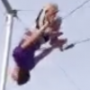
Entry seven is cool. I like the abstract-ness of it, but I can't tell what it is at all. For me, that doesn't mesh with the theme of the competition, although I may have missed the photographer's intention. The contrast between left and right is great, and it's an excellent example of where a centre-framing is appropriate.
Entry eight is kinda boring. It's a pretty good example of "out of the airplane window" pictures, as they go, but I wish the top third wasn't so plain. The edge of the sun's halo is cut off at the right, and the angles of the sunbeams and visible land throws the composition completely.
Entry nine is boring. Part of the dash is occluded by glare, too, which completely spoils the symmetrical effect that I assume the photographer was going for.


 This topic is locked


 #2 and #7 both seem great but i have no idea what they are.


![[Results] Photographica #17: Sky - last post by Eefi](http://neocodex.us/forum/uploads/profile/photo-thumb-52286.png?_r=1397069495)
![[Voting] Photographica #17: Sky - last post by Prisca](http://neocodex.us/forum/uploads/profile/photo-57811.gif?_r=1464079665)