Quantcast

Jump to content


Photo

My first sig posted on the forums!


  • Please log in to reply
43 replies to this topic

#26 Fox

Fox
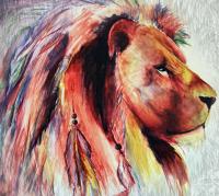
  • <img src ='http://i25.tinypic.com/4jw8jl.png'>

  • 3247 posts

Posted 27 October 2004 - 01:11 AM

No one makes good Non Tech ani'mation so thats the best ive seen.

View Post


Is that a challenge? :)

I've done a little bit of ani'mation with the ani'mals in Poser... Perhaps I should put 'em in sigs. But Ali will kill me... :sofa:

#27 SteWieH

SteWieH
  • 3423 posts

Posted 27 October 2004 - 02:26 AM

hella nice signature man. you can use that for your signature here if you like. I like it alot

#28 Xiphos

Xiphos
  • 3365 posts

Posted 27 October 2004 - 02:30 AM

you should apply.

#29 Cooliodoc

Cooliodoc
  • 1244 posts

Posted 27 October 2004 - 02:49 AM

yea it's alright. I'm guessing you used paint shop *raises eyebrow* ahh mebbe not. Some criticisms, the text is butt ugly, I detest 3d text, the ani'mation is sorta effective but maybe the double lighnight strike shouldn't just be the two previous lightning strikes that are before itm cos that looks a lil dodgy.
overally ok, I'm guessing you didn't draw any part of the background or even edit :) but cos it still looks ok I'll give you 6.5/10

#30 Dazz

Dazz
  • Musicyclopedia

  • 3242 posts


Users Awards

Posted 27 October 2004 - 03:11 AM

cooliodoc you remind me of si'mon cow(whatever his name is) because when everyone thinks it's good givving it good rates then there comes you and you give them low rates and say about bad things :)

#31 Cooliodoc

Cooliodoc
  • 1244 posts

Posted 27 October 2004 - 03:16 AM

I think it's si'mon cal, but I never whatched american idol when it was on in australia cos they were all crap :) hehe not that the australian idols are much better.
All I'm doing is saying what I actually think, not pampering hte person with biased good ratings. How else can they get better....yes..yes, that's why I do it *grins evilly*

#32 Dazz

Dazz
  • Musicyclopedia

  • 3242 posts


Users Awards

Posted 27 October 2004 - 03:19 AM

well you could say "maybe you could I'mprove on......" then it will be suggesting what needs I'mproving on :)

#33 Cooliodoc

Cooliodoc
  • 1244 posts

Posted 27 October 2004 - 03:21 AM

nah, harsh critisism all the way.
I was pissed off people were giving it 10/10 etc when it obviously needs I'mprovement. so I had to burst some1's bubble

#34 Dazz

Dazz
  • Musicyclopedia

  • 3242 posts


Users Awards

Posted 27 October 2004 - 03:23 AM

I think someone might be jelous :)

#35 XenoCyde

XenoCyde
  • 4223 posts

Posted 27 October 2004 - 03:27 AM

Well uits coolio's opinion isnt it :)

I'mo I cudda done that sig in 2 mins.

There could have been some extra effects like using clouds over the pic or some grungy effects or stuffles like that.

#36 Dazz

Dazz
  • Musicyclopedia

  • 3242 posts


Users Awards

Posted 27 October 2004 - 03:28 AM

yes it is his opinion and well you have to think his first sig posted on forums

#37 XenoCyde

XenoCyde
  • 4223 posts

Posted 27 October 2004 - 03:29 AM

Posted :) Made? :) lol

If its his first then thats excellent.

#38 Cooliodoc

Cooliodoc
  • 1244 posts

Posted 27 October 2004 - 03:43 AM

yea anyone remember my first sig ? *looks at xeno* it were funky and psychadelic lol. The effect that coudl have been I'mproved in my opinion is to make some how either increase the shine on the guys helmet when the lightning strikes, or even better have the guy infront of the lightning and when it strikes have the guy go really dark like real light night would to a person, make them a silhoette

#39 Leo

Leo
  • 1020 posts

Posted 27 October 2004 - 04:47 AM

kuut, ed naymmo muugc paddan fedr y cdnuga

drq vun dra ramb, hajan naymecat dra esbundyhla uv y cdnuga.

me apply for graphix team? :blink: I think I still need I'mproving..

cooliodoc I dont mind critisi'm, liked to hear ppls opinions of my work so I can I'mprove it :closedeyes:. This is my first sig with ani'mation, I havent made many sigs in total (I didnt know what a stroke was!) but ive made other I'mages apart from sigs so I find it a bit easier :)

#40 Evan

Evan
  • 2605 posts


Users Awards

Posted 27 October 2004 - 05:48 AM

I was just wondering, does a stroke make it look like its more professional?  Everyone is like "must have stroke."  :blink:

#41 XenoCyde

XenoCyde
  • 4223 posts

Posted 27 October 2004 - 07:33 AM

lol stroke is cool

who wanna see my 1st?

#42 Rs712x

Rs712x
  • 509 posts

Posted 27 October 2004 - 08:20 AM

I agree with Foxbane it needs a stroke but apart from that is brilliant 10/10

#43 Leo

Leo
  • 1020 posts

Posted 27 October 2004 - 12:23 PM

ty for all ur opinions, greatly appreciated. I editted a bit and added a third lighting bolt in the distance lol, and I have included a stroke... umm I'm not sure if it shows... :(


#44 Cooliodoc

Cooliodoc
  • 1244 posts

Posted 27 October 2004 - 10:33 PM

I like this one alittle more :p but the last lightning strike in the distnace doesn't look quite right :) Don't have bevelled/3D text cos I think it looks yucky. Maybe a nice white or black with white stroke font from dafonts.com or abstractfonts.com


0 user(s) are reading this topic

0 members, 0 guests, 0 anonymous users