Quantcast

What works and what is paused · Email is limited to account activation and password resets.

Jump to content


Photo

Check tis out


  • Please log in to reply
10 replies to this topic

#1 Dagron

Dagron
  • 1501 posts

Posted 08 May 2005 - 03:29 AM

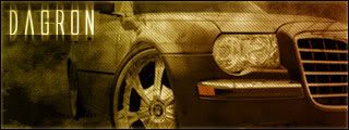
I just made this :p

Posted Image

Advertisement

    #2 Ashaide

    Ashaide
    • 4621 posts

    Posted 08 May 2005 - 03:30 AM

    I do like the font you used :) the car sorta looks all kinda creepy :) very good job

    #3 Dagron

    Dagron
    • 1501 posts

    Posted 08 May 2005 - 12:17 PM

    Thnx I did it with these awesome grunge brushes I found :p

    #4 redlion

    redlion
    • I don't exist!

    • 12072 posts


    Users Awards

    Posted 08 May 2005 - 12:59 PM

    You use that font a lot. I'm starting to not like it. Other than that, its cool.

    #5 Siner

    Siner
    • 1120 posts

    Posted 08 May 2005 - 01:17 PM

    You use that font a lot. I'm starting to not like it. Other than that, its cool.

    View Post


    I somewhat disagree, he uses it a lot but it's an amazing font and the effect he created is very nice  :thumbsup:

    #6 Dagron

    Dagron
    • 1501 posts

    Posted 08 May 2005 - 10:26 PM

    Thank you siner :D

    #7 huggles290

    huggles290
    • 9 posts

    Posted 08 May 2005 - 10:57 PM

    the font is really cool I like it, gotta install photoshop and make myself a siggy or attempt to *splutters* :p

    #8 Jamie

    Jamie
    • 1233 posts

    Posted 08 May 2005 - 11:29 PM

    You use that font a lot. I'm starting to not like it. Other than that, its cool.

    View Post


    I agree^^

    then who am I to complain about fonts I must use the same one alot :rofl:

    nice sig, need more contrast

    #9 Dagron

    Dagron
    • 1501 posts

    Posted 09 May 2005 - 12:22 AM

    Jamie I dont like "light" sigs I like darker ones thats why all my are made to look like space/creepy :p

    #10 Jamie

    Jamie
    • 1233 posts

    Posted 09 May 2005 - 12:42 AM

    Jamie I dont like "light" sigs I like darker ones thats why all my are made to look like space/creepy :p

    View Post


    I see, I love light sigs (all my sigs are bright if you havent noticed) so I'm just use to seeing them lol

    #11 Leo

    Leo
    • 1020 posts

    Posted 09 May 2005 - 07:50 AM

    Font is nice, just dont overuse it mate. Have some more variety in your sigs :thumbsup:


    1 user(s) are reading this topic

    0 members, 1 guests, 0 anonymous users



