
I have a new avatar and a new signature... Do you like it?
I would like to know your opinion so I can share with you some designs. Thanks
Avatar:
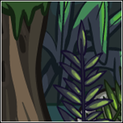
Signature:
What works and what is paused · Email is limited to account activation and password resets.




Posted 24 February 2013 - 04:42 AM
I have a new avatar and a new signature... Do you like it?


Posted 24 February 2013 - 06:59 AM
Your avatar is fine, simple but fine! But about the siggy; the font is pretty bad sorry, its basic looking and overbearing. Also for me it's a little on the big side, maybe you can shrink it down a little? But that's just personal preference 
(I am aware looking at my signature is like staring at roadkill but there is a joke behind it, its not meant to show skill lol)
Posted 24 February 2013 - 11:47 AM
Wow thank you for it. I'll try to change the font and the proportions.
Sadmin
Posted 24 February 2013 - 03:10 PM
No, I hate it, mine's better 
jks I like the combo of avatar and signature, to me, the font is a bit plain, but I like crazy-assed fonts anyway. Good work so far Look forward to seeing what else you can do. Also, have a go at the signature of the week competition! You just never know, you might win a prize!

Posted 24 February 2013 - 03:27 PM
Your avatar is fine, simple but fine! But about the siggy; the font is pretty bad sorry, its basic looking and overbearing. Also for me it's a little on the big side, maybe you can shrink it down a little? But that's just personal preference
(I am aware looking at my signature is like staring at roadkill but there is a joke behind it, its not meant to show skill lol)

Sadmin
Posted 24 February 2013 - 03:39 PM
Pretty harsh of her, hey mate? *cries*

Not an error.
Posted 27 February 2013 - 09:04 AM
I think the thieves guild text at the bottom spoils it. Else it's better than the old one, imho.


Posted 27 February 2013 - 09:09 AM
I also like the second version better, but perhaps without the text across the bottom.
Posted 27 February 2013 - 10:21 AM
Yep, the font was bad...

Is better without font?
Posted 27 February 2013 - 01:10 PM
I'm going to do more plot signatures. TY to all


Posted 03 April 2013 - 08:18 PM
I like it a lot. =D I need to make one myself- my account is so plain right now.
0 members, 0 guests, 0 anonymous users

Community Forum Software by IP.Board 3.4.8
Licensed to: Neocodex


