I think it looks great! The brushing/pattern blends well with the bangs in their face. Great job.
Thats the only thing I really liked about this one

Wubly. Can't fault it.
Colouring is v.good, will check out xiphos tut later
Real life images ftw!
See! Strifey agrees with me, therefore it must be true
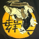
Ohhh it nice to see somthing other than gaming renders being used for sigs.. very nice colors and that render blends perfectly with the colors
the only thing that you could change would be the text.. something other than pixel text
Mmm. I suck at text. I'll try some stuff in a minute to see if I can come up with something.
yay I helped, looks good man im feelin it, wut filter is that
That would be Sumi-e (the last one under brush strokes). Yeah, your colouring works pretty well.
Any other comments?
GIVE ME CRITICISM!!!!!