Before voting, please be sure that you have read the rules regarding the voting process found HERE
1. 
2. 
3. 
Voting Closes: 12:00 AM NST, Tuesday August 21st
Good luck to the entrants!


 This topic is locked
🍴Aioli-American🍴
Posted 19 August 2012 - 07:52 AM
Posted 19 August 2012 - 09:26 AM

KatDog 5ever
Posted 19 August 2012 - 10:26 PM

I hate everyone.
Posted 20 August 2012 - 12:56 AM

Posted 20 August 2012 - 01:00 AM
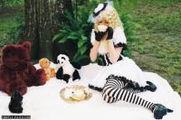
Had to -rep you...I mean... nr. two def is the prettiest. But it's some kind of Manga thing, so I just can't vote for it.
My vote goes to nr. three. It's moving. Moving is good!

Foxy Lady
Posted 20 August 2012 - 02:31 AM

Posted 20 August 2012 - 06:50 AM

Posted 20 August 2012 - 07:38 PM
Edited by esotericaKoalan, 20 August 2012 - 07:42 PM.
Keeper of Secrets
Posted 20 August 2012 - 08:02 PM
Pity point for number 1.
The person tried at simple typography, which can be really effective sometimes, and he even put effort in font variation.
Unfortunately, it wasn't very effective this time, mainly due to excessive negative space.
(Okay, maybe I'm just justifying why I'm voting for #1 instead of #2...)
Number 2 is just generic c4d spam, and number 3 is just generic animation. And even though I would much rather use number 2 than number 1 in an actual signature, number 1 gets my pity point.

Sadmin
Posted 20 August 2012 - 09:43 PM
Pity point for number 1.
The person tried at simple typography, which can be really effective sometimes, and he even put effort in font variation.
Unfortunately, it wasn't very effective this time, mainly due to excessive negative space.
(Okay, maybe I'm just justifying why I'm voting for #1 instead of #2...)
Number 2 is just generic c4d spam, and number 3 is just generic animation. And even though I would much rather use number 2 than number 1 in an actual signature, number 1 gets my pity point.
woomy woomy manmenmi!!
Posted 21 August 2012 - 07:34 AM
I mean... nr. two def is the prettiest. But it's some kind of Manga thing, so I just can't vote for it.
My vote goes to nr. three. It's moving. Moving is good!


Posted 21 August 2012 - 08:40 AM
For the numerous people who have said this theme is too hard: The reason I want to keep it as only shades of red, green, and blue is because we had a color splash theme and the easiest way to approach this theme would be to slap red, green, and blue onto a black and white picture. I'm not going to be anal about the whole shades of the color thing, but try to remain as true to the theme as possible. It's meant to be a challenge.
Edited by Dealin, 21 August 2012 - 08:40 AM.

Banned from trading - Do not trade with this user
Posted 21 August 2012 - 08:42 AM
Im voting for number 3. Honestly, I dont think number 2 follows the rules as posted by the creator of this weeks SoTW:
This post:
http://www.neocodex....1/#entry1616516
AND
It seems like he / she would have greyscaled the image first, then applied the colors. Even then, theres some offshade in it. Its good work, but not in line with this weeks SoTW imo.
Edited by Dorkie, 21 August 2012 - 08:42 AM.
Posted 21 August 2012 - 08:46 AM
Since there are 3 entrants will there be a first second or third winner or first second or just first.
I think what they meant was like a color splash. I would have done a color splash. I personally think Black & White should have been aloud since Black & White since they are really only shades. I entered one but I used black as a shade.
Banned from trading - Do not trade with this user
Posted 21 August 2012 - 08:53 AM
Well i wouldnt consider that fair, since there is a good chunk of "black" in number 2 as a shade.
I would have entered myself, but I didnt think we were allowed to use greyscale, then throw colors on top of it (as the OP said we COULDNT).
Posted 21 August 2012 - 09:02 AM
I would have entered myself, but I didnt think we were allowed to use greyscale, then throw colors on top of it (as the OP said we COULDNT).
Arts & Graphics →
Arts & Graphics General →
Graphics Resources →
Free PSDStarted by esotericaKoalan, 16 Aug 2012 |
|
|
||
Arts & Graphics →
Arts & Graphics General →
SOTW #41Started by fimend, 13 Aug 2012 |
|
|
0 members, 0 guests, 0 anonymous users

Community Forum Software by IP.Board 3.4.8
Licensed to: Neocodex